-
Architects: João Mendes Ribeiro
- Year: 2015
-
Photographs:Nelson Garrido

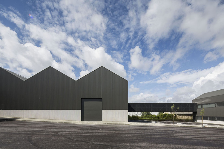
Text description provided by the architects. Located in Coimbra's industrial area, the Adémia office building and storage warehouse is made of two volumes combining warehouse space, office facilities and a commercial area. The smaller two storey building is located at the limit of the site and faces the main street. The commercial space is set at the entrance level with offices located on the first floor. A larger and longer one storey building (the warehouse) is located at the centre of the site and it is formed by a combination of five equally sized units with pitched roofs. The combination of the two volumes occupies the entire length of the plot. A flat-roofed passage on the first floor connects the two buildings, creating a view over the courtyard at street level, which is used as meeting space and a parking area. The selected materials play a major role in the characterization of the two volumes. Constructive solution and detailing become the formal identity of these buildings. A horizontal line runs across the two buildings, creating a clear distinction between two key materials: concrete and grey coated corrugated steel panels.

A cast in-situ concrete wall emerges from the foundations level to meet this horizontal line. The casting frame has the same shape as the corrugated steel panels above it, creating a continuous pattern from the top to the bottom of the walls. Above the horizontal line, the entire façade surface is clad with corrugated steel places, including at points where there are openings. In the office building, where windows must allow opening for ventilation purposes, a similar system for cladding was used integrating micro-perforated corrugated steel screens. This solution was also applied in one of the façades of the elevated passage between the buildings, which gives it a sense of transparency. Ultimately, the consistent use of these two materials throughout the project, and the inventive ways in which they are combined together, creates a unique identity for both buildings to act as a whole.

Inside the warehouse an industrial atmosphere is achieved by the use of polished concrete flooring and exposed mechanical and electrical infrastructures as well as exposed constructive elements, such as the roof structure, concrete walls and steel on wall finishing. Inside the building a small mezzanine built with a metallic structure and concrete grey panels houses the staff facilities and links to the elevated passage via a staircase.


The office building displays different rooms with lean-to ceiling that recreate the exterior roof. Birch plywood doors and furniture and plasterboard walls divide the space, where continuous self levelling mortar flooring is used to unite the space.

Before both buildings were occupied by their regular program (a warehouse for a painting and auto supplies company), a pop up art exhibition opened. There were no walls to display art, so a “box in the box” was the concept behind the exhibition layout. The first box was the warehouse with its concrete walls and the second box as a temporary set of walls, made with a wooden structure and plasterboard surfaces. The temporary walls were disconnected from the concrete walls and displayed three exhibition rooms.


